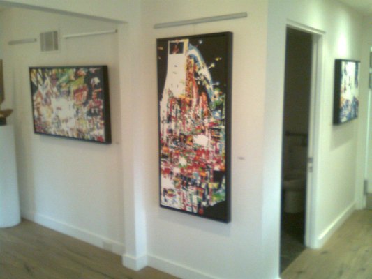
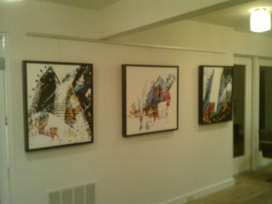
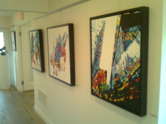
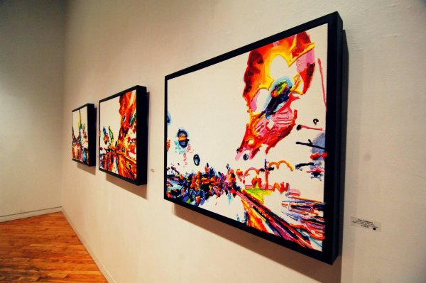
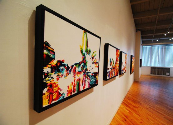
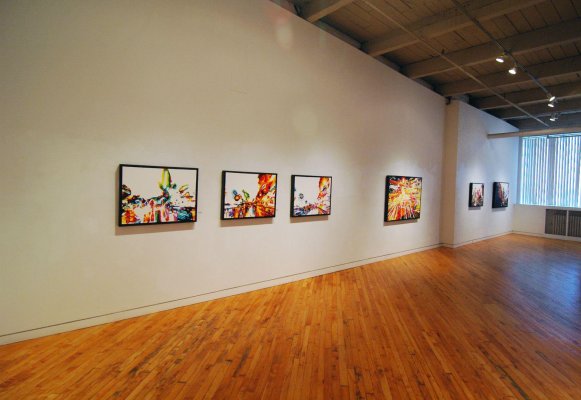
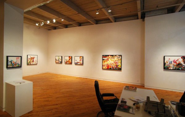
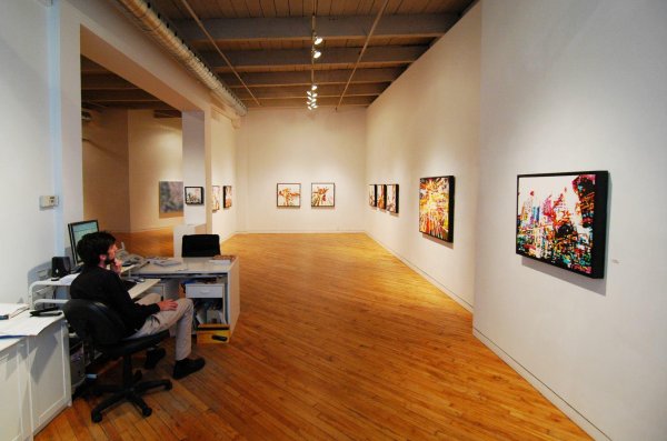
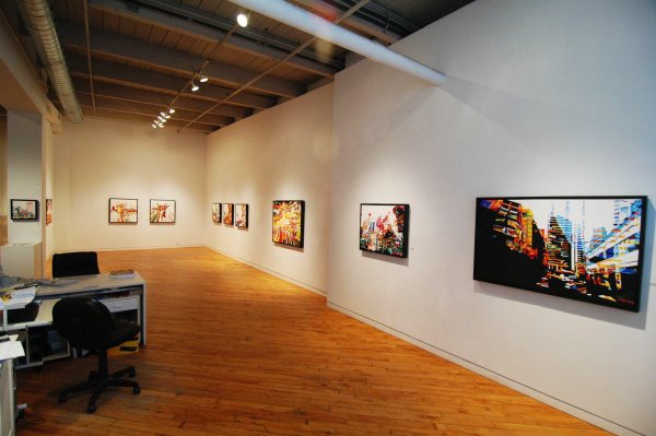
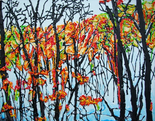
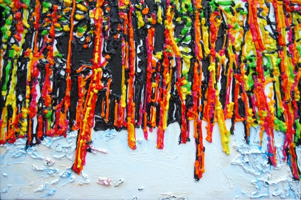
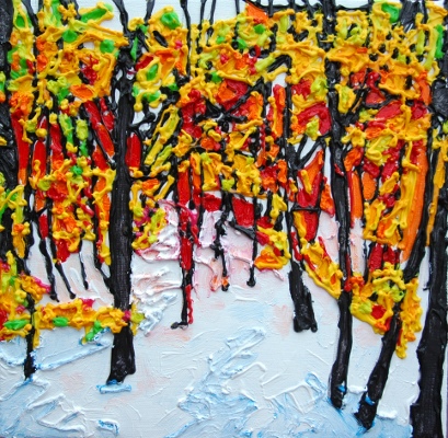
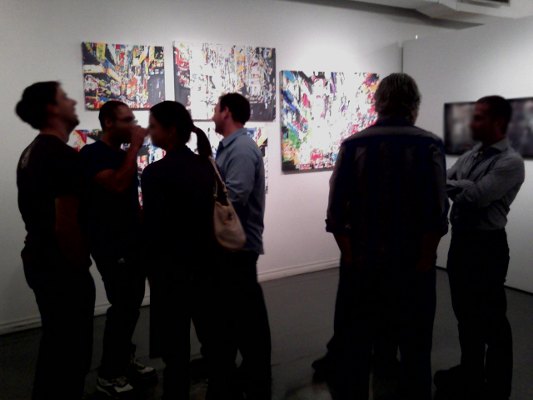
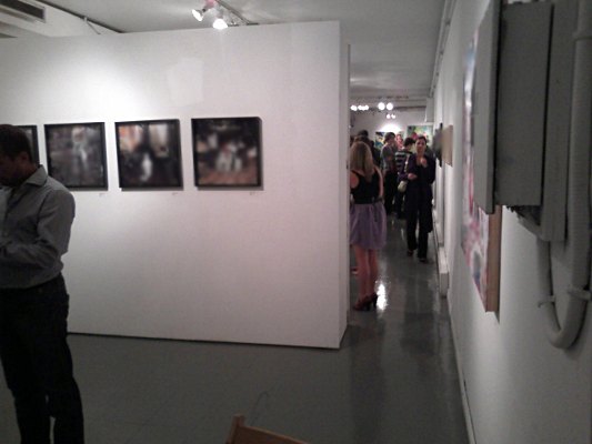
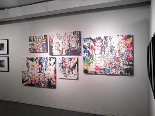
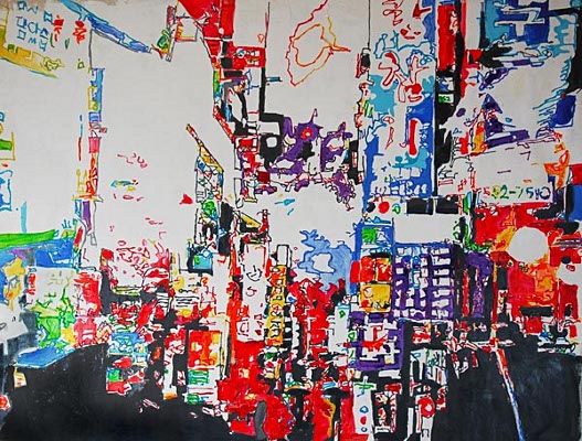
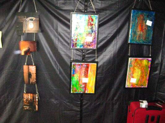
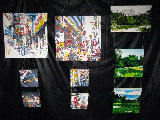
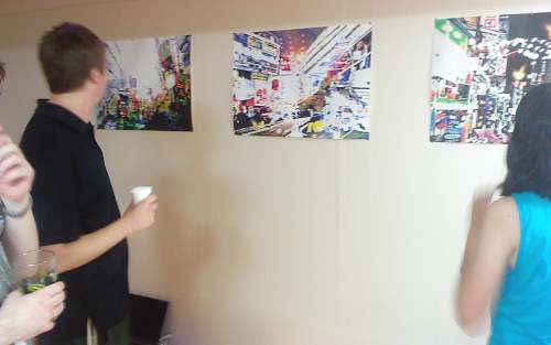
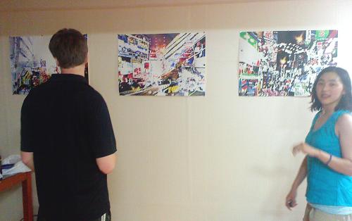
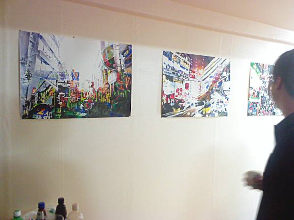
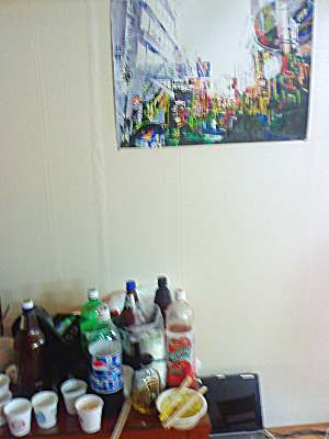
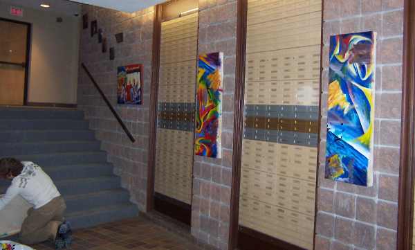
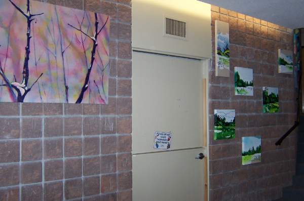
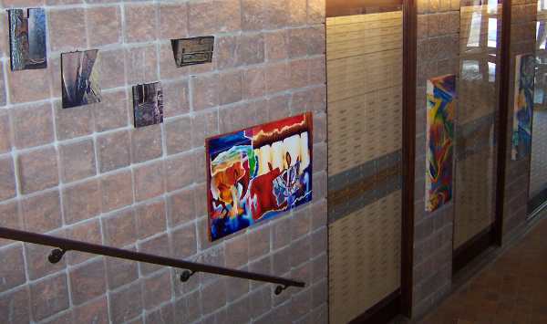
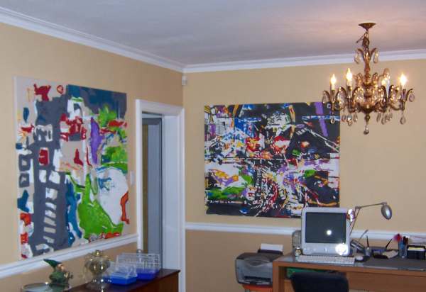
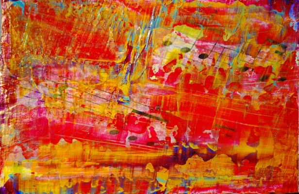
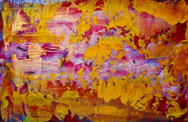
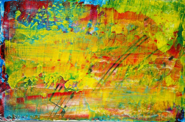
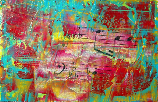
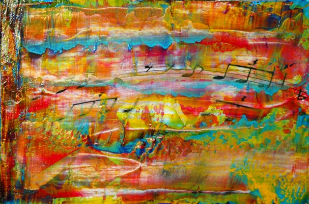
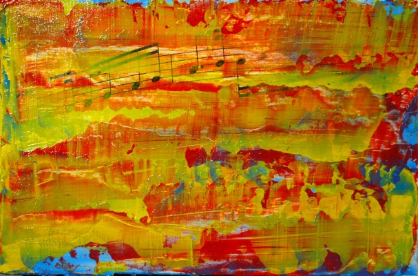
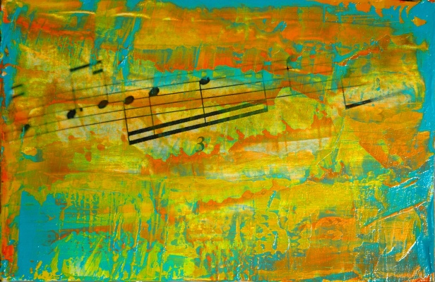
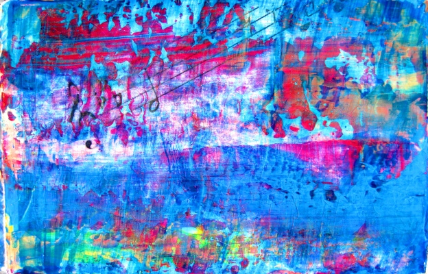
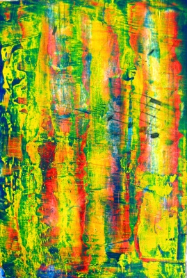
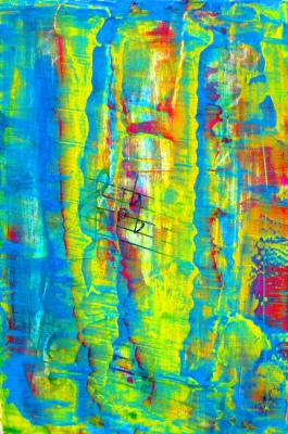
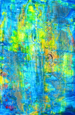
I was invited to display some paintings on the walls of Connors Music. I enjoyed going back to an older style I hadn’t used in several years. Luckily, I keep pretty good notes of my sketches; I had no trouble at all re-creating the desired colours and textures.
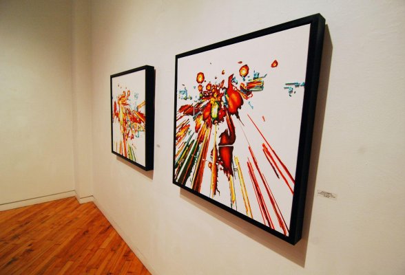
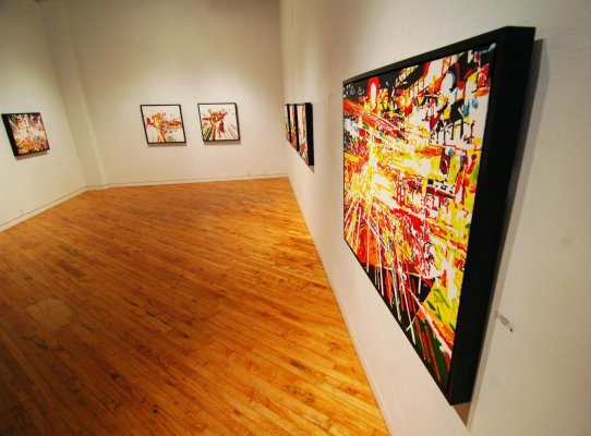
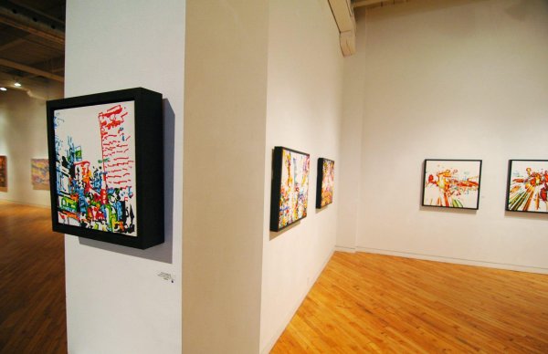
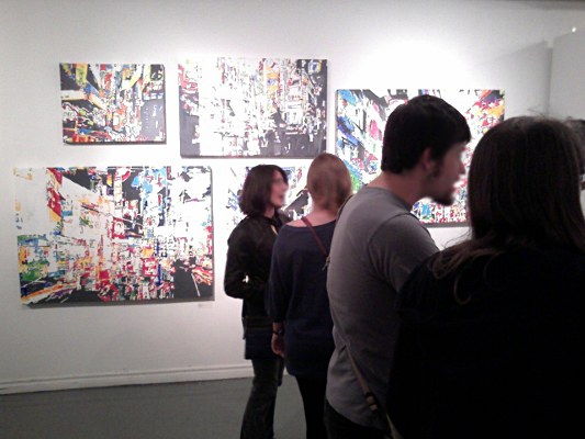
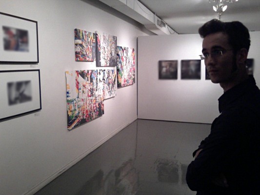
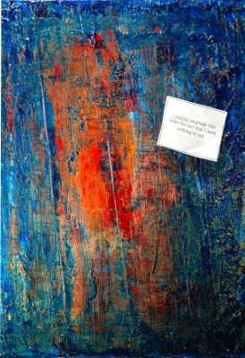
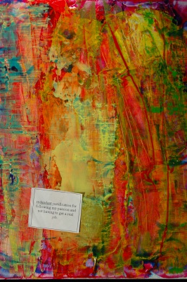
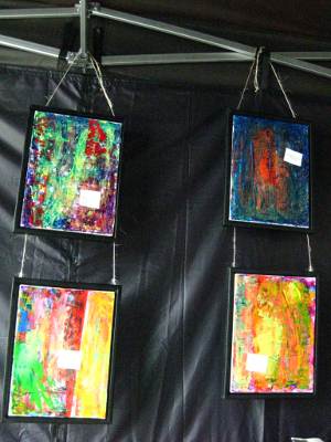
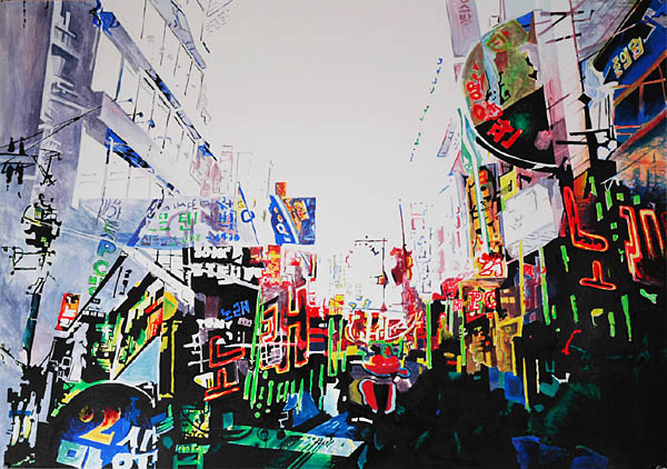
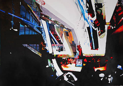
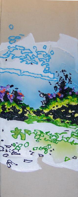
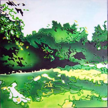
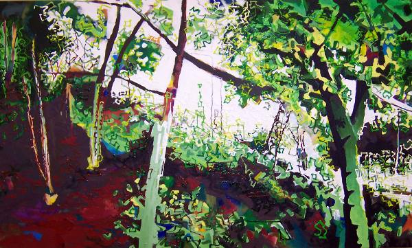
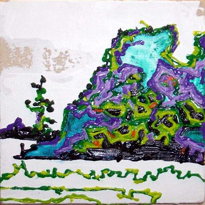
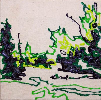
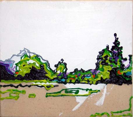
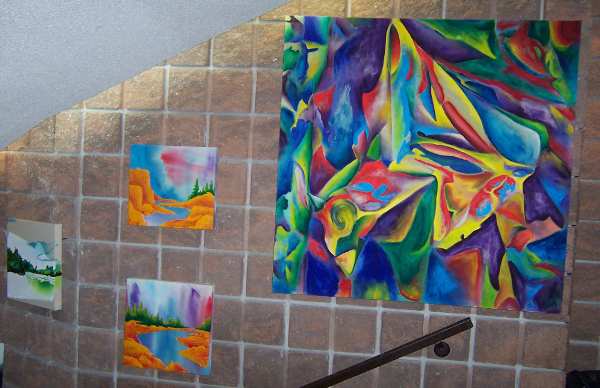
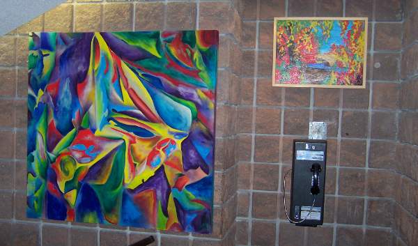
The jewel-like surface quality of these paintings can not be fully captured on a computer screen. Transparent, opaque, iridescent, and metallic pigments are layered and glazed on top of one another, creating the illusion of physical depth, as well as some very pronounced colour shifting as the angle of light hitting the surface changes. What looks red and blue from one angle suddenly becomes green and gold from another.
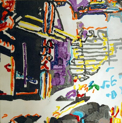
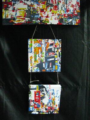
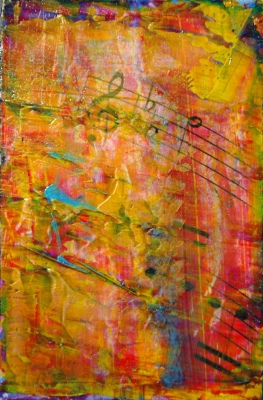
For this particular series, I knew well in advance that it would be displayed at a music store, so introducing some sort of a music-inspired imagery was a no-brainer. I added some images of music score by using a gesso/toner transfer technique, which I had been wanting to play with for a while.
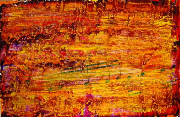
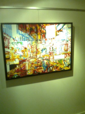
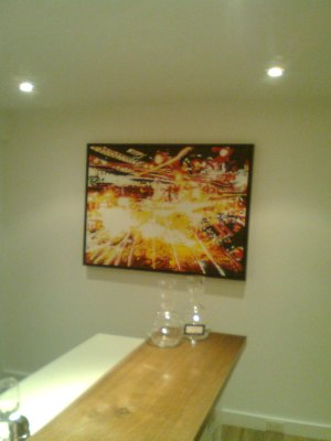
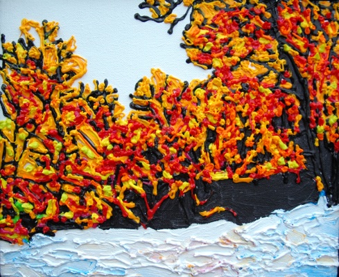
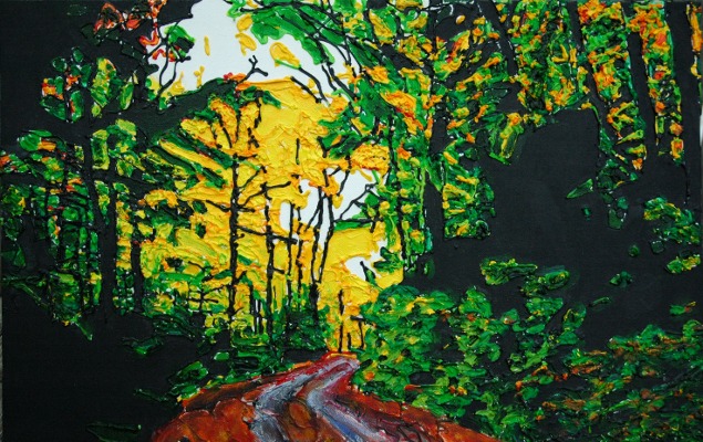
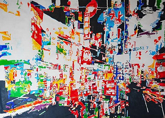
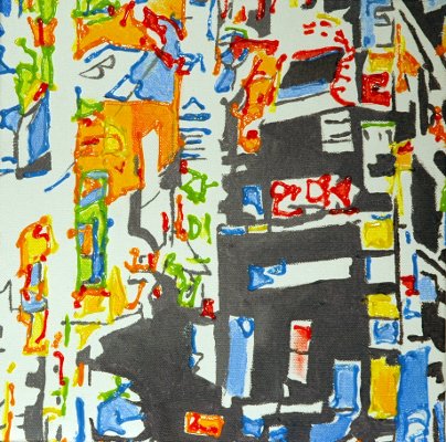
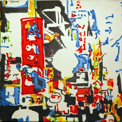
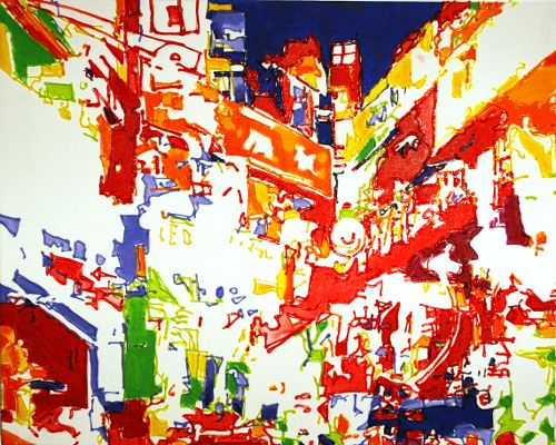
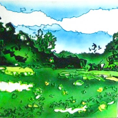
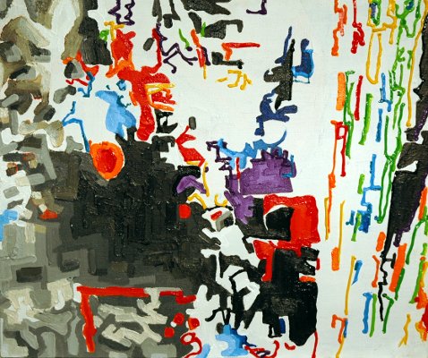
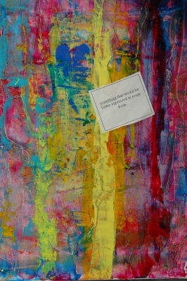
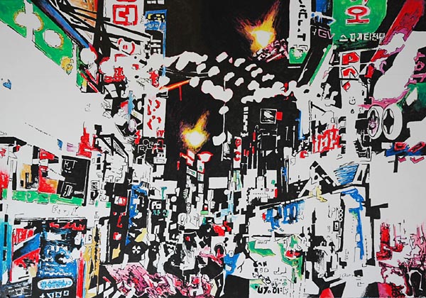
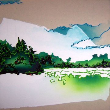
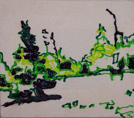
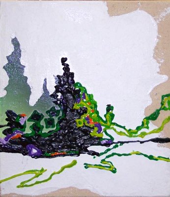
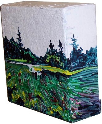
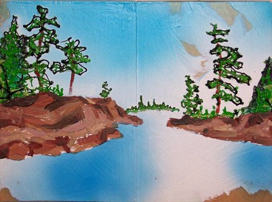
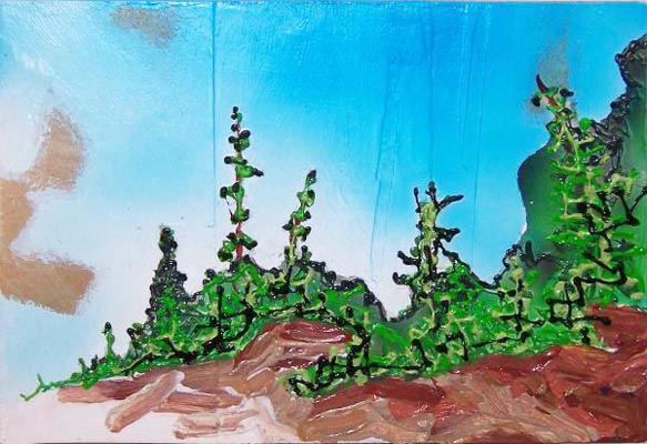
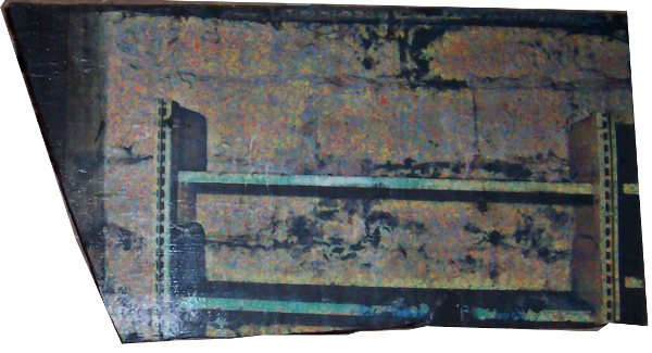
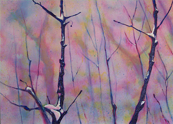
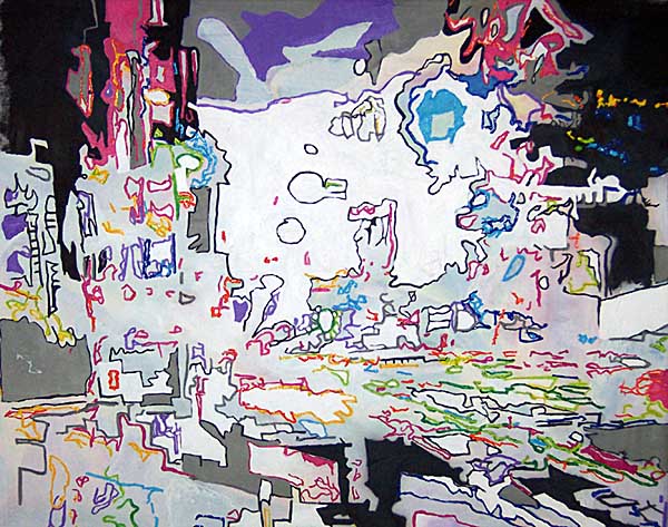
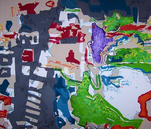
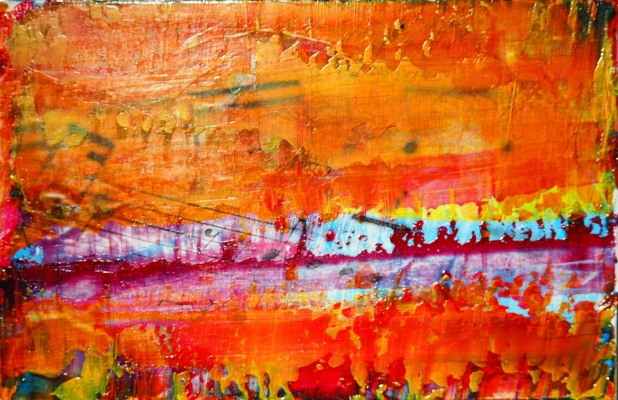
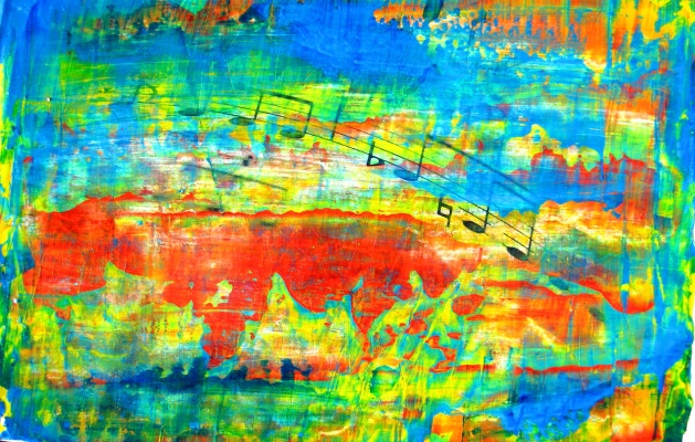
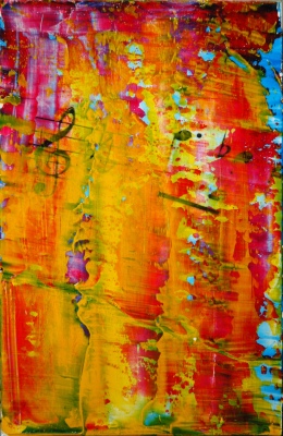
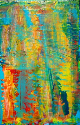
Untitled, 6″ X 9″, acrylic and toner on wood panel, 2010.
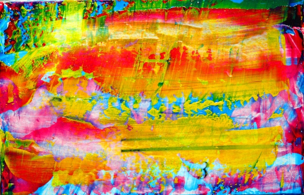
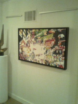
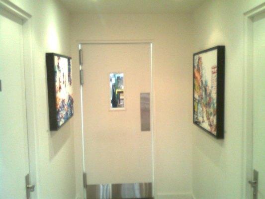
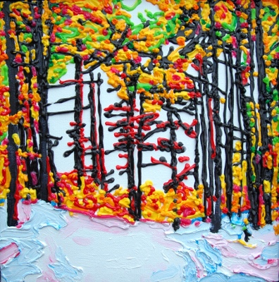
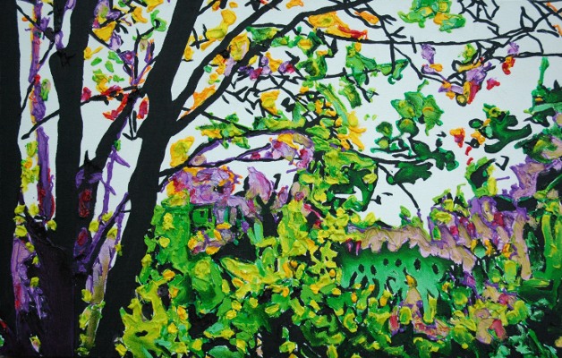
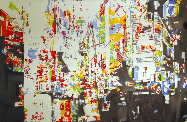
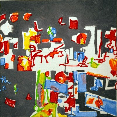
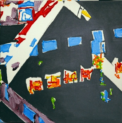
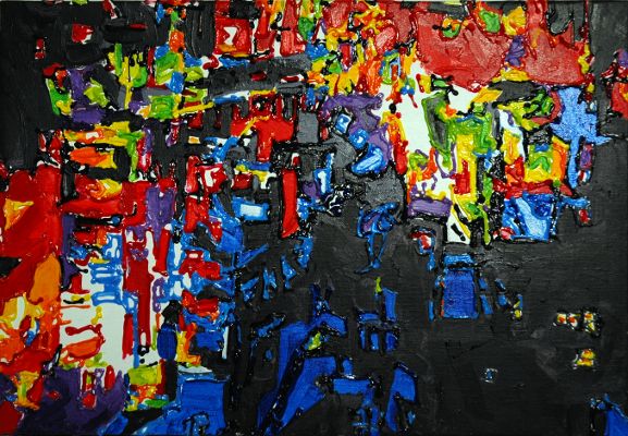
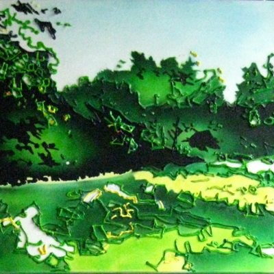
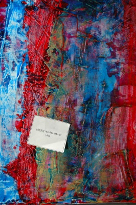
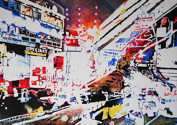
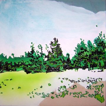
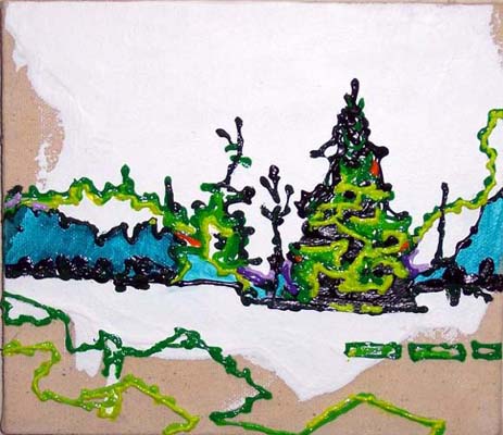
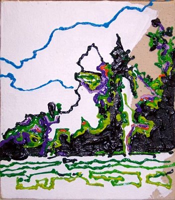
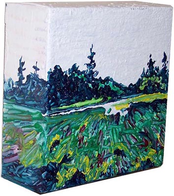
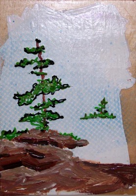
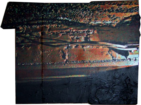
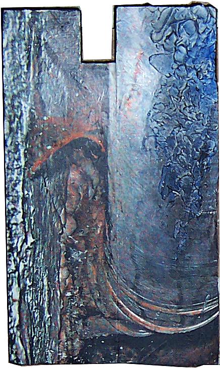
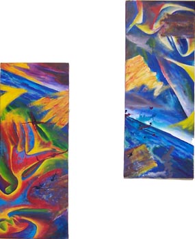
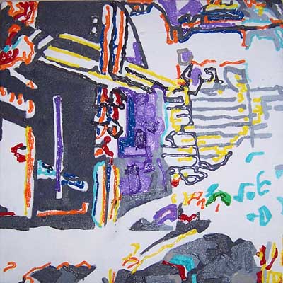
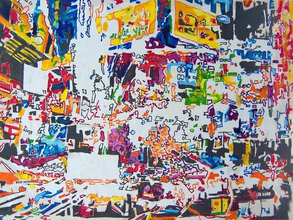
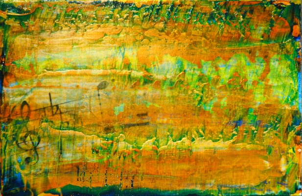
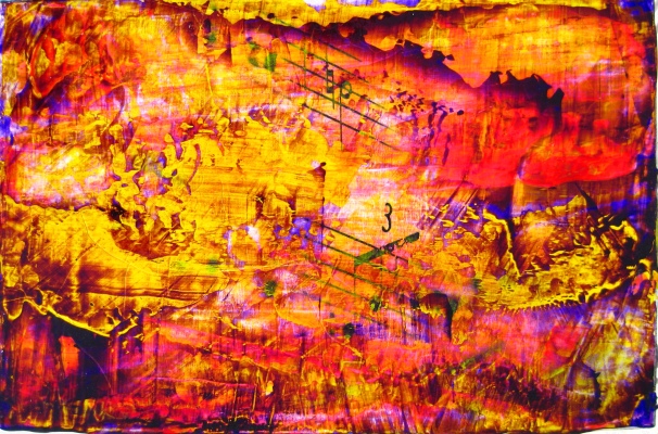
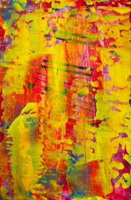
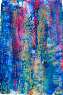
Untitled, 6″ X 9″, acrylic and toner on wood panel, 2010.
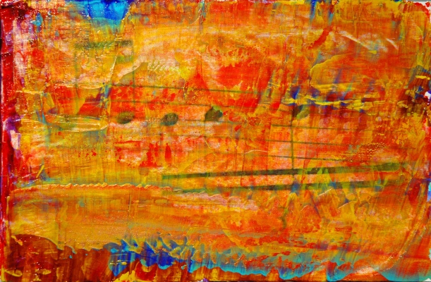
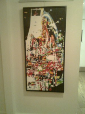
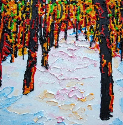
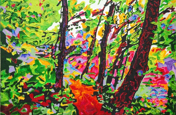
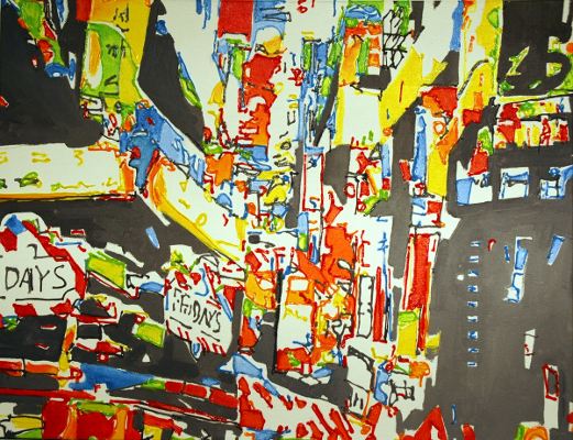
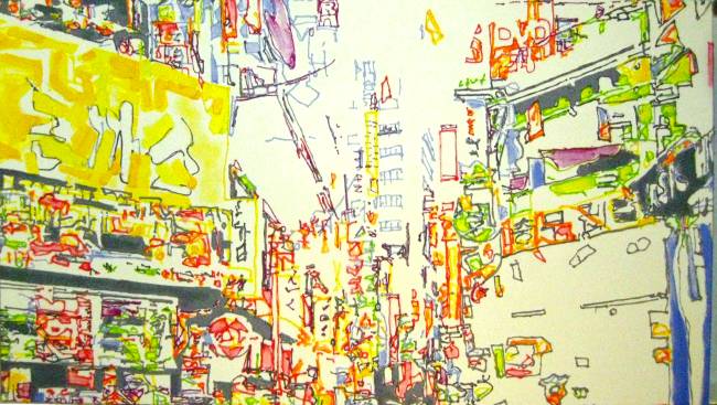
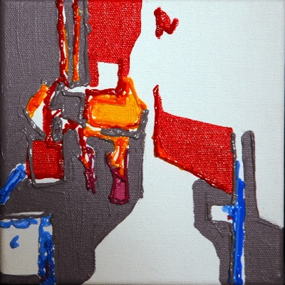
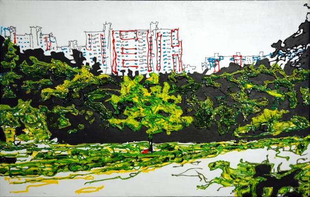
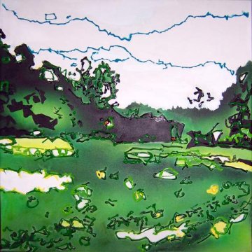
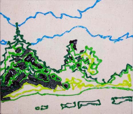
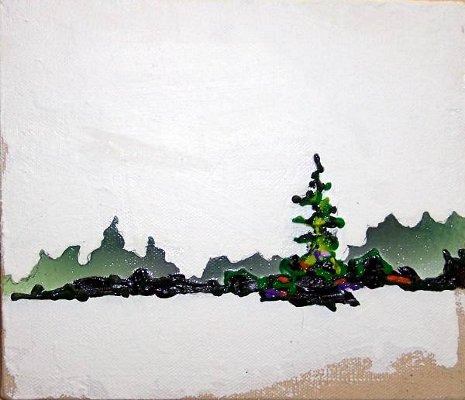
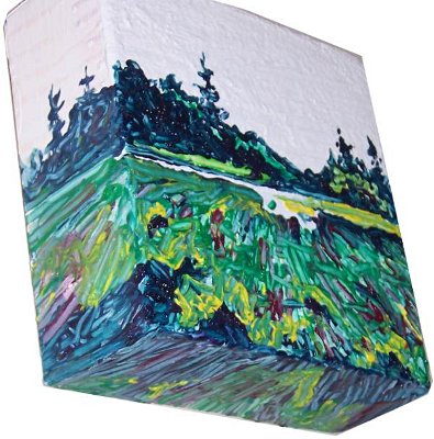
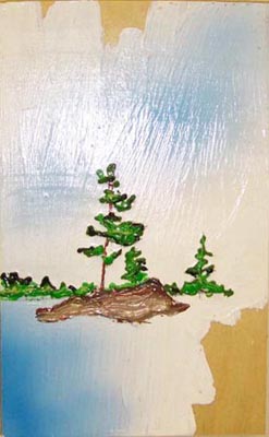
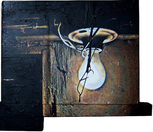
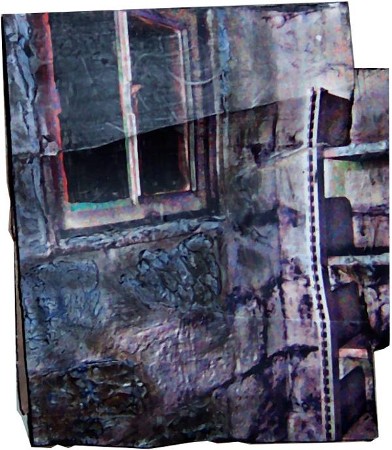
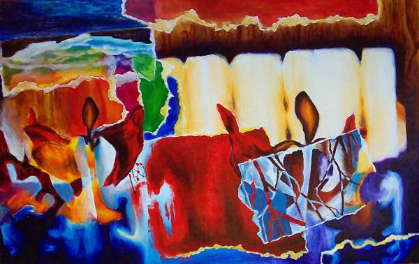
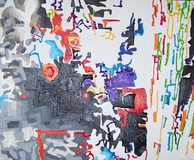
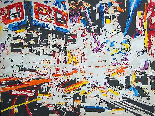
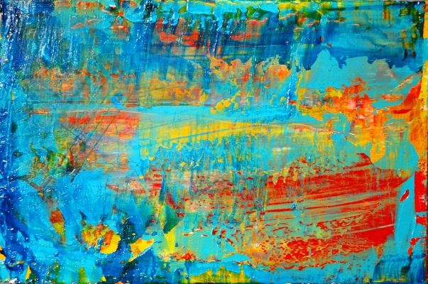
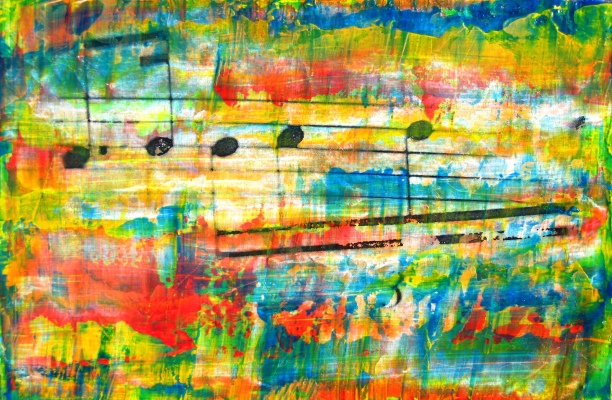
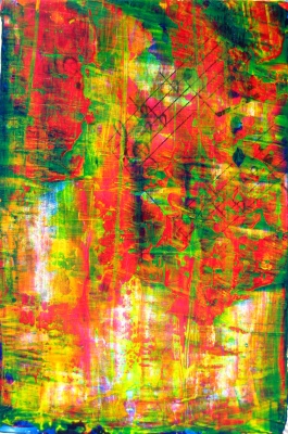
Untitled, 6″ X 9″, acrylic and toner on wood panel, 2010.
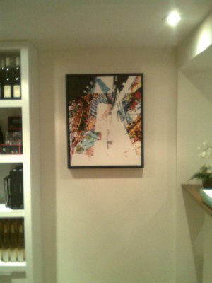
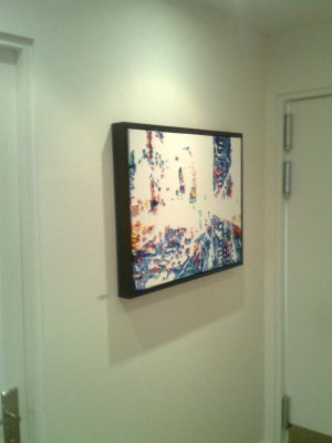
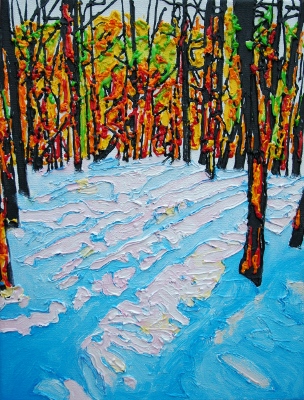
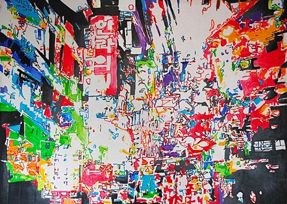
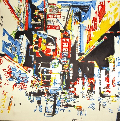
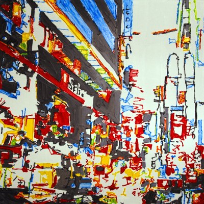
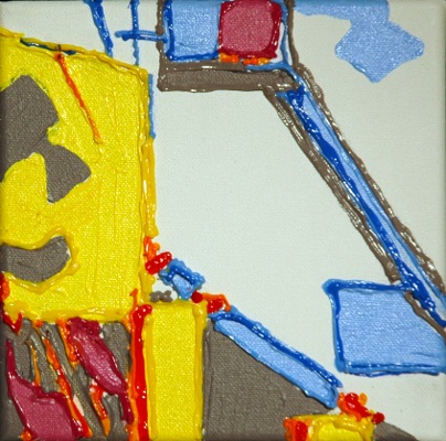
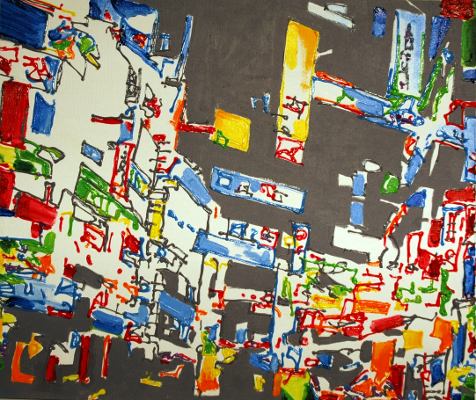
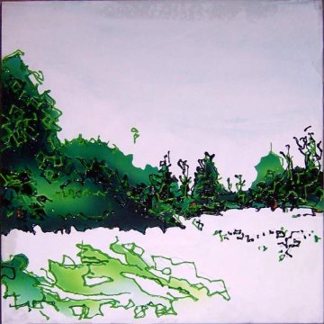
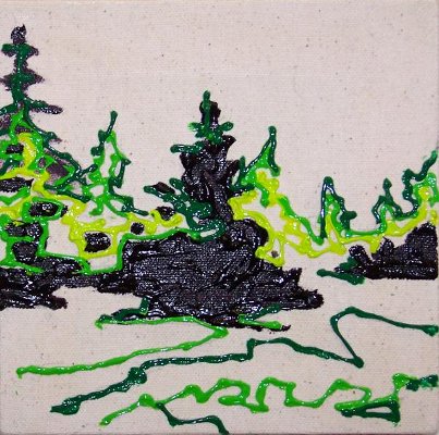
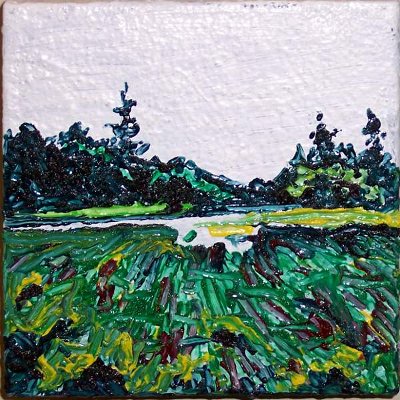
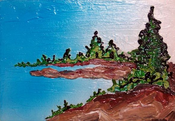
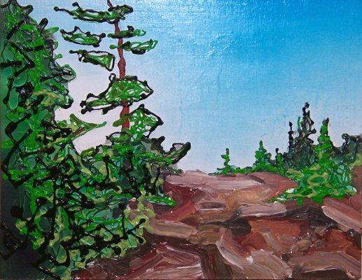
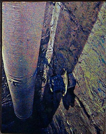
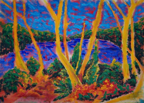
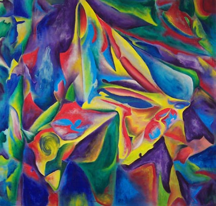
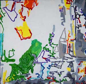
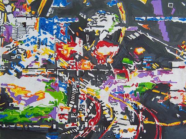
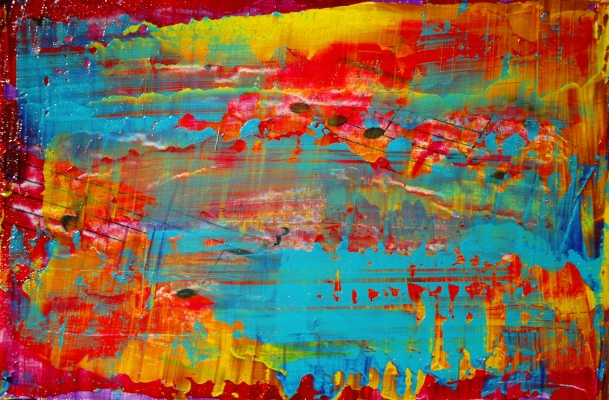
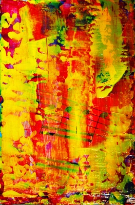
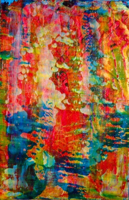
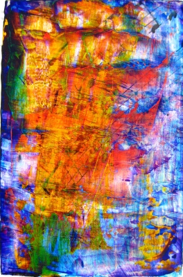
Untitled, 6″ X 9″, acrylic and toner on wood panel, 2010.
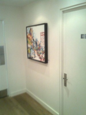
Untitled, 6″ X 9″, acrylic and toner on wood panel, 2010.
Untitled, 6″ X 9″, acrylic and toner on wood panel, 2010.
Untitled, 6″ X 9″, acrylic and toner on wood panel, 2010.
Untitled, 6″ X 9″, acrylic and toner on wood panel, 2010.
Untitled, 6″ X 9″, acrylic and toner on wood panel, 2010.
Untitled, 6″ X 9″, acrylic and toner on wood panel, 2010.
Untitled, 6″ X 9″, acrylic and toner on wood panel, 2010.
Untitled, 6″ X 9″, acrylic and toner on wood panel, 2010.
Untitled, 6″ X 9″, acrylic and toner on wood panel, 2010.
Untitled, 6″ X 9″, acrylic and toner on wood panel, 2010.
Untitled, 6″ X 9″, acrylic and toner on wood panel, 2010.
Untitled, 6″ X 9″, acrylic and toner on wood panel, 2010.
Untitled, 6″ X 9″, acrylic and toner on wood panel, 2010.
Untitled, 6″ X 9″, acrylic and toner on wood panel, 2010.
Untitled, 6″ X 9″, acrylic and toner on wood panel, 2010.
Untitled, 6″ X 9″, acrylic and toner on wood panel, 2010.
Untitled, 6″ X 9″, acrylic and toner on wood panel, 2010.
Untitled, 6″ X 9″, acrylic and toner on wood panel, 2010.
Untitled, 6″ X 9″, acrylic and toner on wood panel, 2010.
Untitled, 6″ X 9″, acrylic and toner on wood panel, 2010.
Untitled, 6″ X 9″, acrylic and toner on wood panel, 2010.
Untitled, 6″ X 9″, acrylic and toner on wood panel, 2010.
Untitled, 6″ X 9″, acrylic and toner on wood panel, 2010.
Untitled, 6″ X 9″, acrylic and toner on wood panel, 2010.
Untitled, 6″ X 9″, acrylic and toner on wood panel, 2010.
Untitled, 6″ X 9″, acrylic and toner on wood panel, 2010.